Guest Curator: Isla Pedrana
Writer, designer, and illustrator Isla Pedrana selected her favorite items from The Archive and describes how history can captivate us in unexpected ways.
Space around the Archive
This archive gives space, and a wider audience, to a range of graphic design outputs and histories that perhaps otherwise would not be seen by so many people; in just being there in all its richness it encourages all sorts of future design imaginations to be expressed. It is exciting to think about the potential work that might come through from folk using it.
Design — to me — is problem solving and finding a beautiful typeface, happy accidents that come from years of practice and exploration. I picked these examples because they caught my eye and made me pause, but I also appreciated seeing in others work reminders of that process. I picked these examples because I saw evidence of location, technique, tools, and typographic knowledge. These spoke to a diversity of approach and story that make this artform exciting to me. In a very busy visual world each of them stopped me and pulled me in, that’s a wonderful thing.
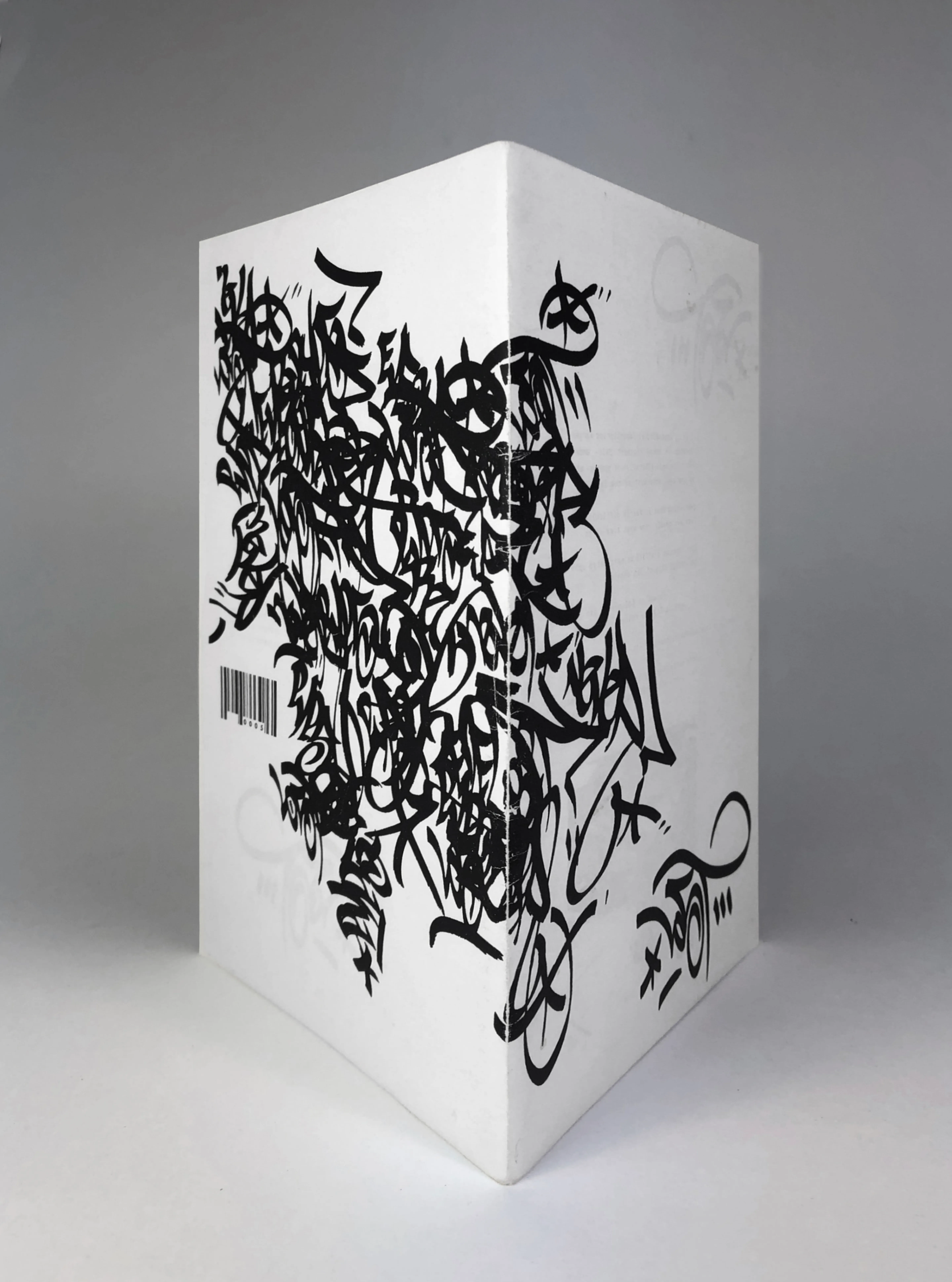
cover design for Lost | Graffiti in the City of Angeles / Issue 0005 by Raymundo Reynoso
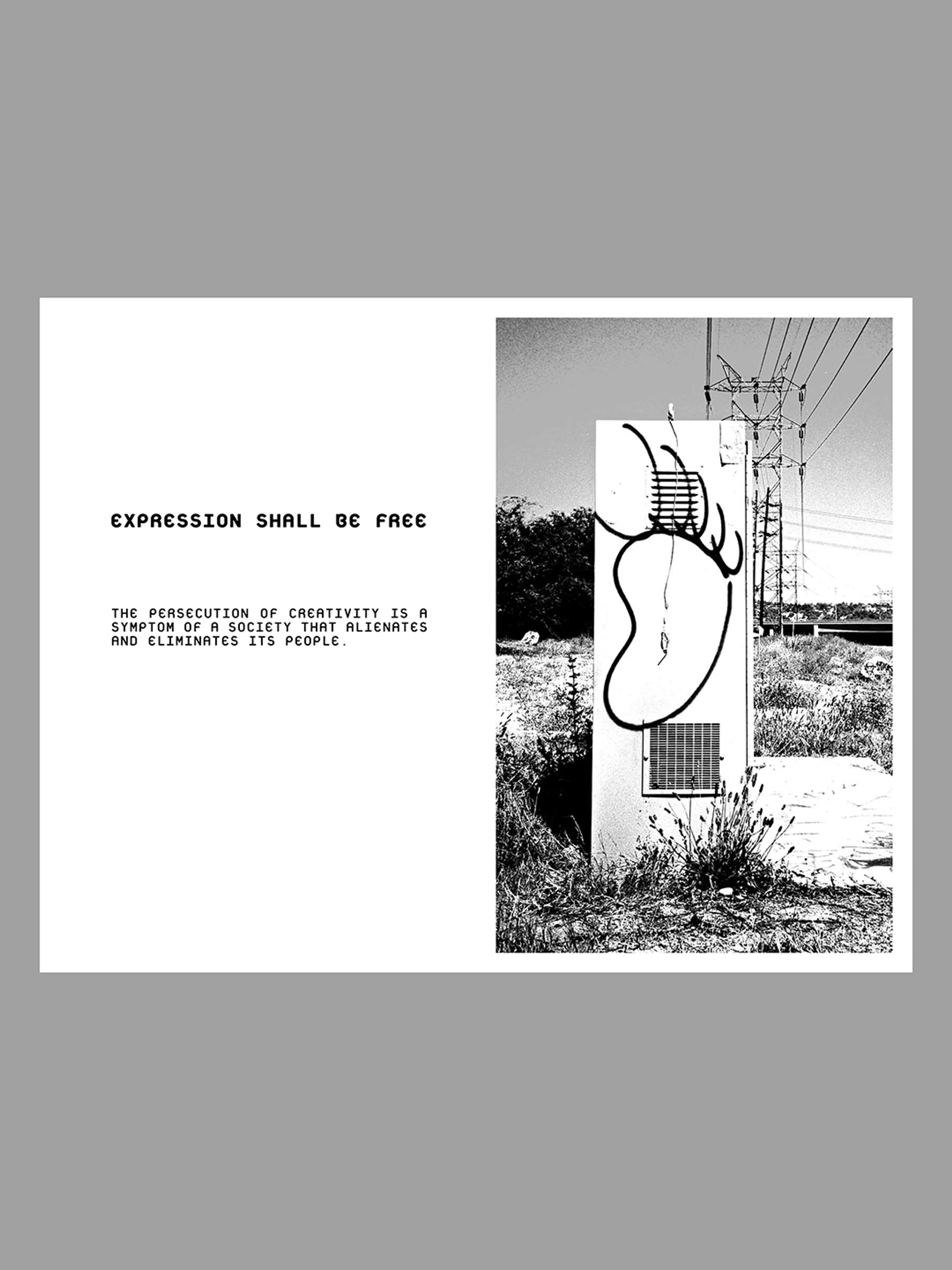
Graffiti in the City of Los Angeles, Lost publication by Raymundo Reynoso, 2001
Lost is a DIY graffiti publication started in 1998 by Eyeone in Los Angeles dedicated primarily to the local graffiti movement. This issue from 2001 was designed and art directed by Raymundo T. Reynoso.
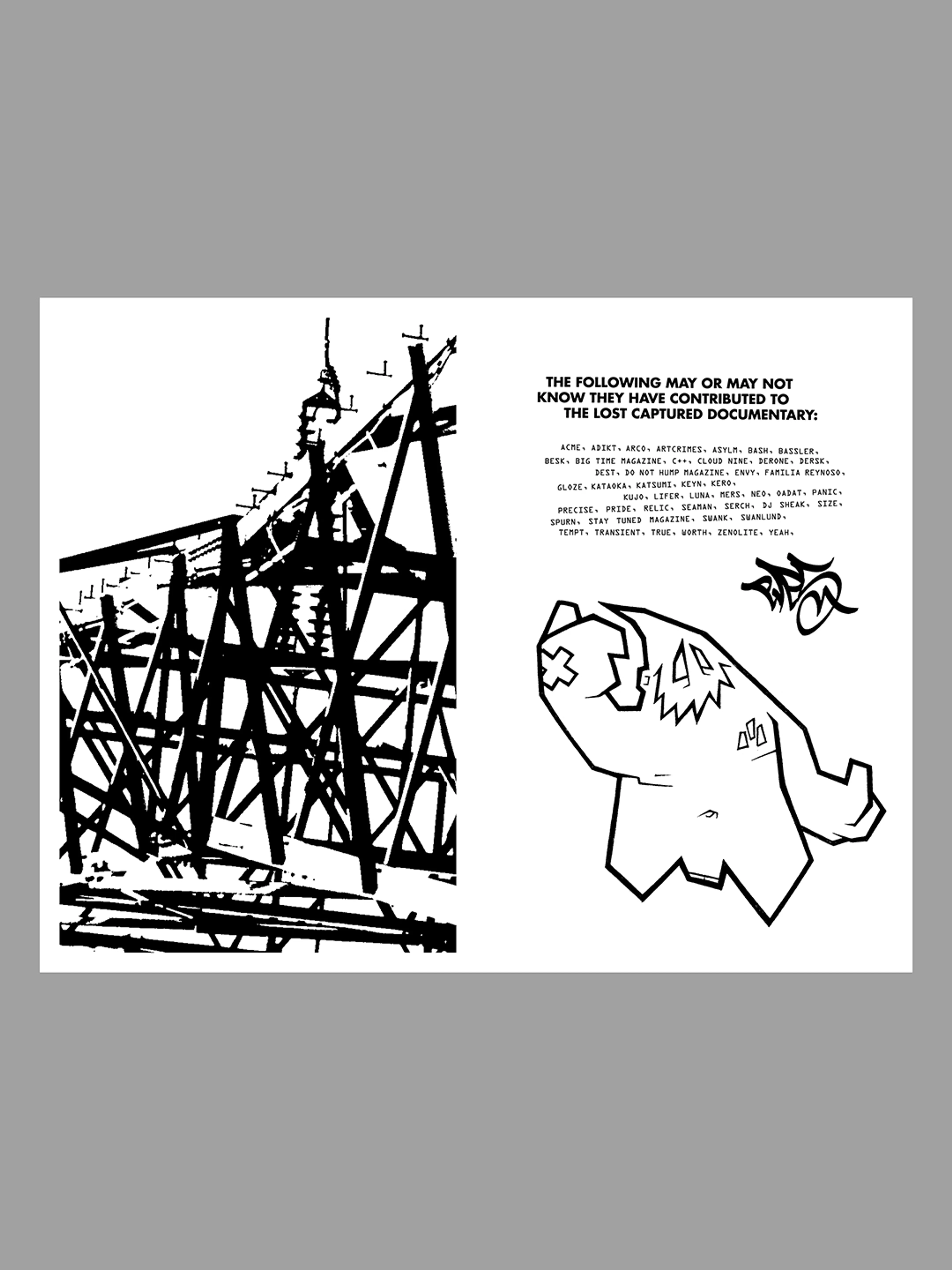
Graffiti in the City of Los Angeles
It was the cover that caught my eye, as it is meant to, stark black letters falling down the outside cover, from left down to far right, only just being caught in their tumble by the name of the zine. Who knows what would have happened if they’d kept on falling.
Street stories captured in a few words, all the more arresting for the insistent black and white colour scheme. Scenes pared back to almost abstract patterns, cranes and transmission lines, graffiti covering whole spreads.
Black and white pattern throughout: monochrome photos, close ups of writing and different typefaces, it shouldn’t but it works.
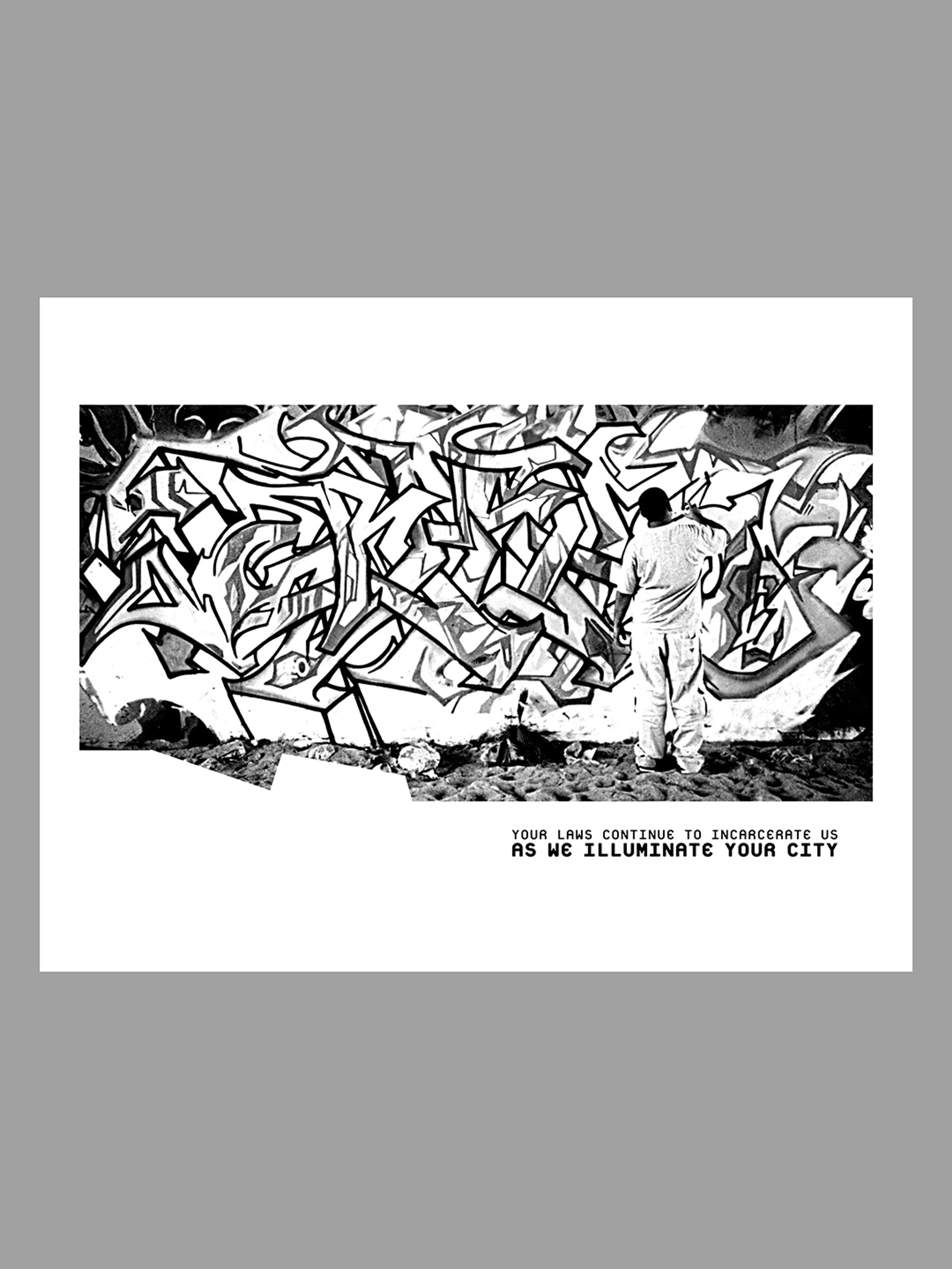
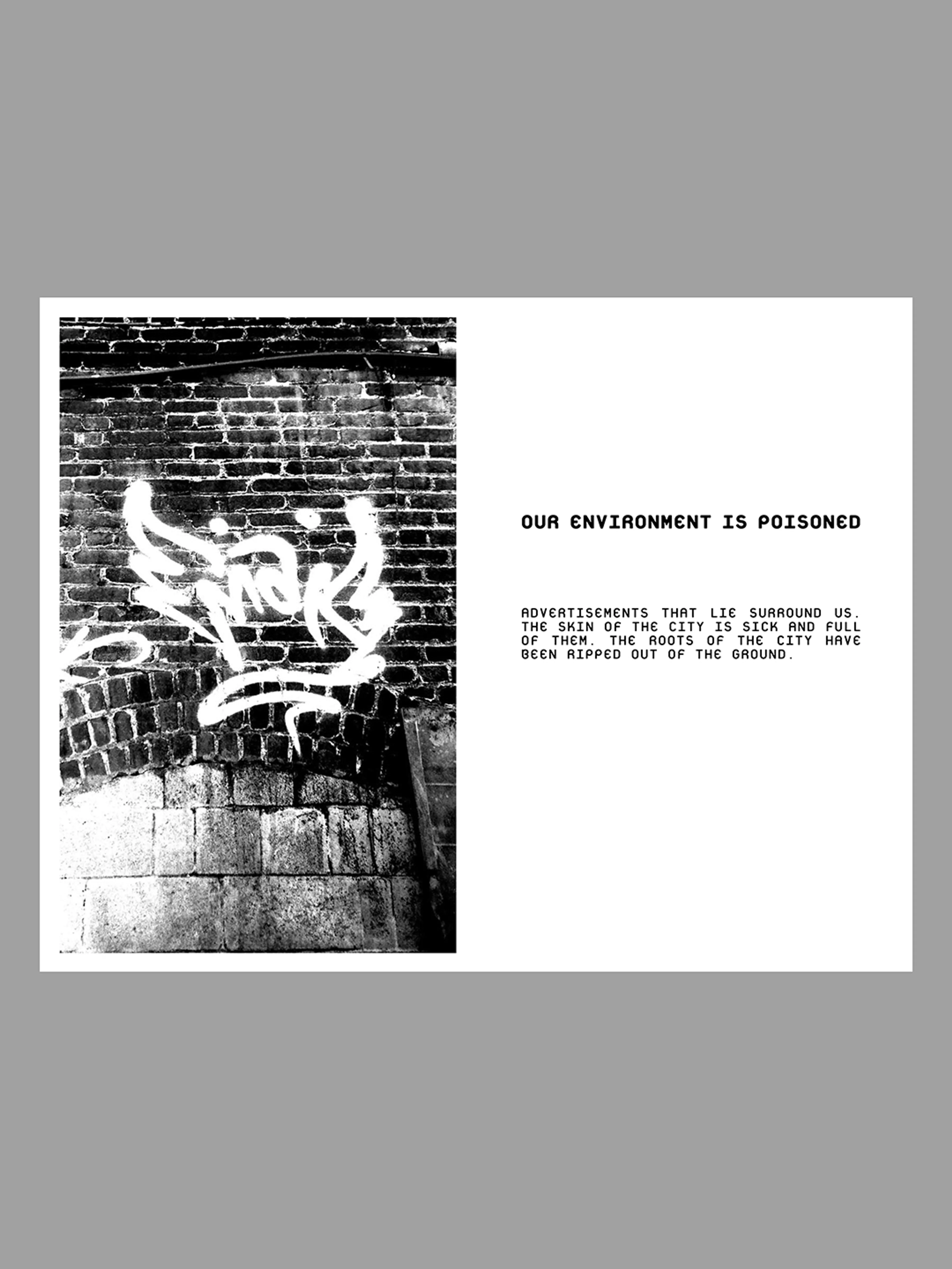
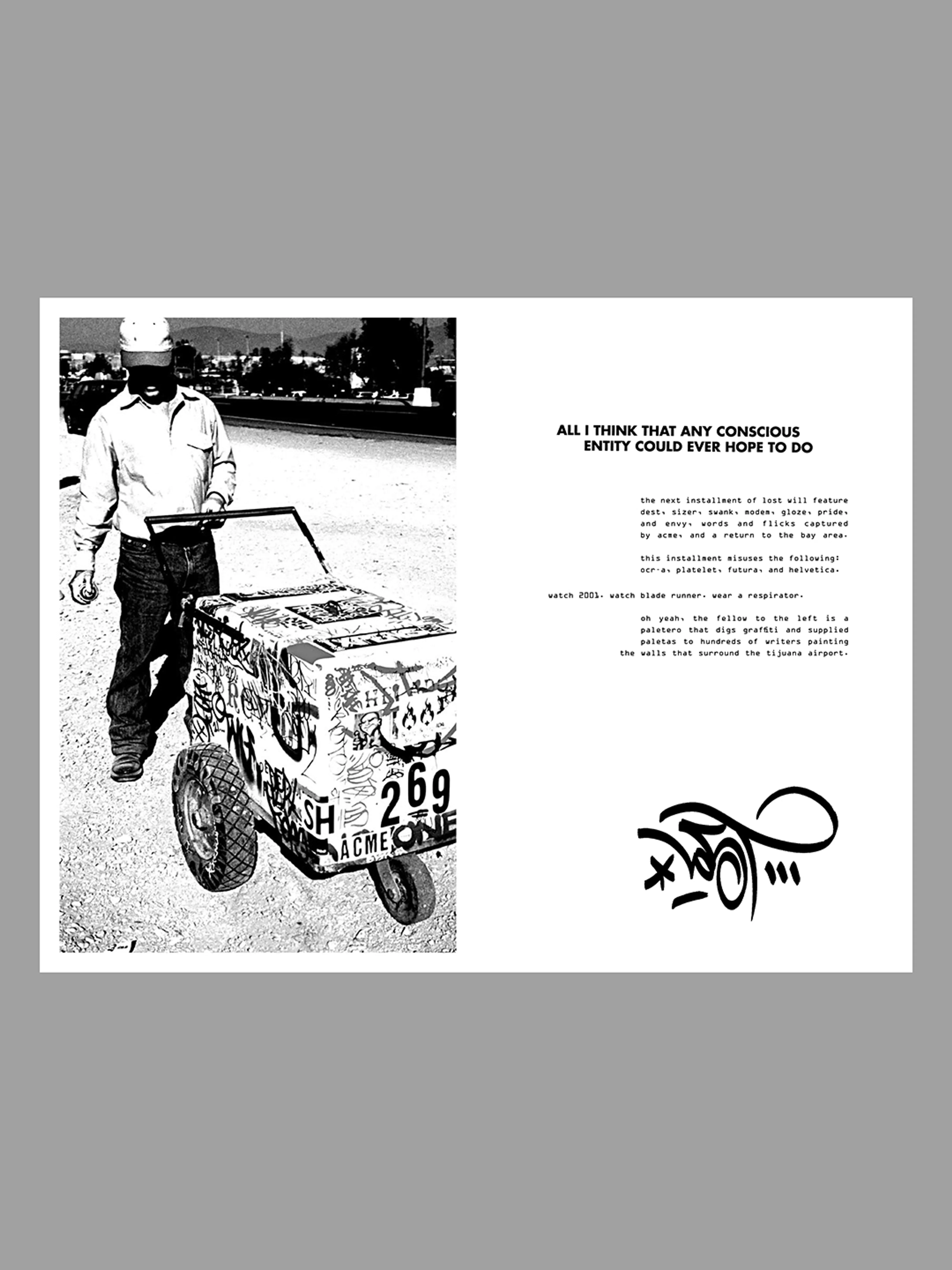
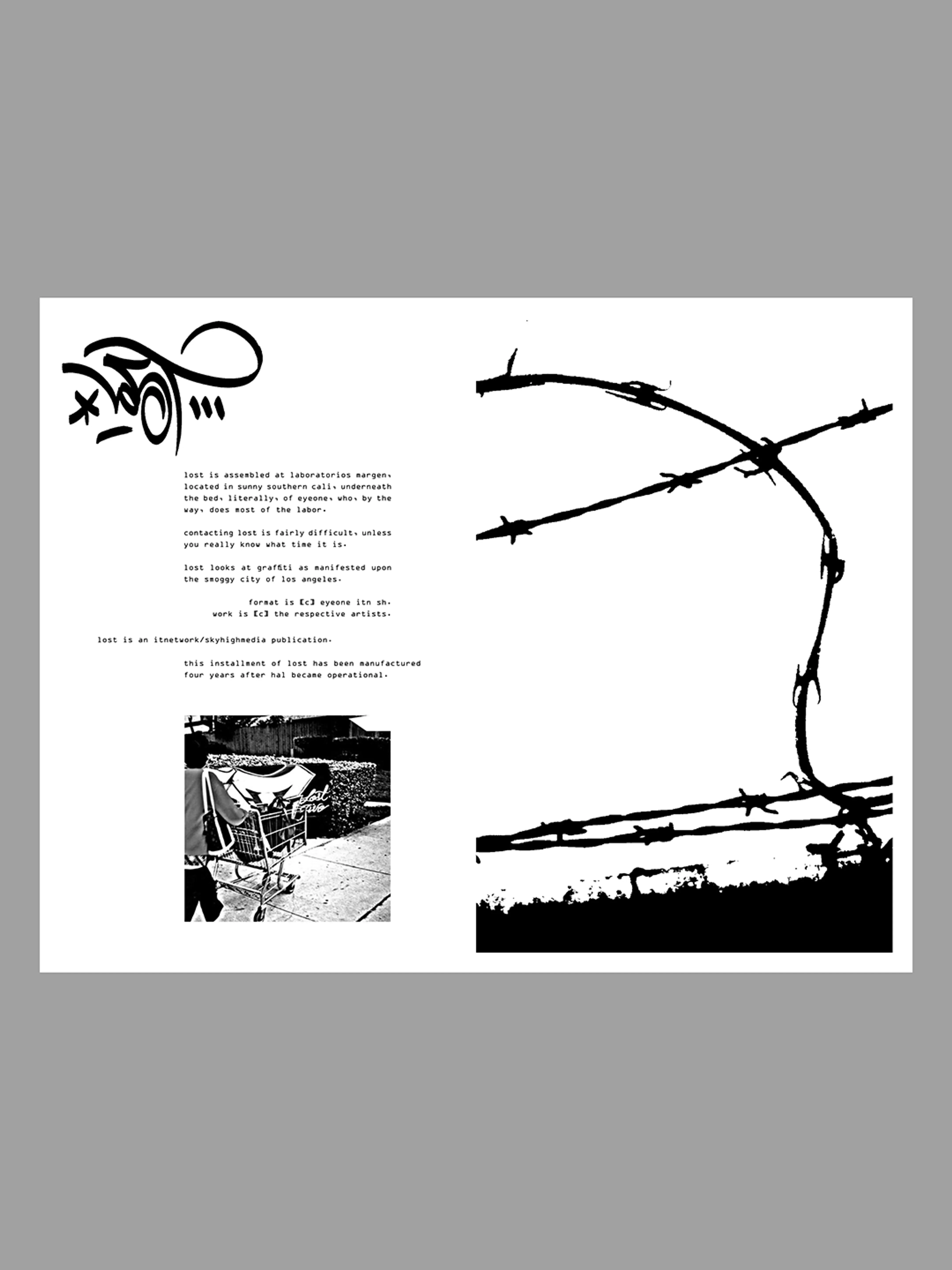
I liked the closeness of it. How the author had brought all of the above down to a few well-designed spreads. And told me a little of Los Angeles in the doing of it. I don’t know LA, and if I did I wouldn’t have read this the same. Always the way when you’re an outsider looking in.
La Comedia Puertorriqueña (The Puerto Rican Comedy), 1970 by Lorenzo Humar
There is so much to see in this one image, your eye keeps going round, getting caught in this letter, that color splash. From the irregular shapes it looks like this typeface started from hand-drawn lettering, these words were then carefully layered with considered color combination overlays, which cut into the letters still further. Counters disappear, then reappear.
La Comedia Puertorriquena (The Puerto Rican Comedy) poster from 1970, designed by Lorenzo Homar
It is almost as if you are seeing paint splashes layered over each other and wherever they seep over and around the letterforms, they just are allowed to do so. It has elements of hand-print to it, hand-drawn type, and the composition is drawn together through incredible use of colour. This is so hard to do, and yet from beautiful colour pattern emerges sense: there is where it is happening, on that date. It all comes into focus from what first appears to be a glorious mash of type and color.
If you have ever cut out type with a scalpel you’ll have seen what happens when you get a little excited and cut beyond where you meant to: letters blend, more white space forms than intended, this poster reminds me of that feeling. Sometimes it’s disappointing if you’ve spent time and your concentration wavers just before you finish, but sometimes something else emerges and sparks another idea.
This poster is by a master (note: (link: https://access.posterhouse.org/exhibition/puerto-rico-in-print-the-posters-of-lorenzo-homar/ text: see exhibition on Lorenzo Homar at Poster House in NYC target: _blank)) and so everything was intentional, but the feeling it reminds me of is a love of the process of design. I am sure the printmaker has also experienced these delightful steps in the process, otherwise how would this wonderful piece of work have come to be?
Hangul. Dream. Path (한글. 꿈. 길) designed by Park Kum-Jun, 2011
It’s the energy that drew me in, but also the way that each piece on this tangled page leads you to the next.
That and when you read that the Hangul form is constructed from typewriter parts. I think most people love a typewriter, the nostalgia of it. Each component is interesting, and you can see how each mark on the page comes to be made. To think of breaking up this machine, and then creating another letterform from the parts…
This poster is completely chaotic and intriguing and makes you want to keep looking at it. Not so much to make out the forms of the typewriter – for me anyway – but to draw on the energy that is fizzing on the page, and the reminder that there are so many different ways to create graphics.
Print magazine cover, 1953 by Ben Shahn
It‘s the jaunt of this. The color and I think hand-drawn typeface, that lovely lowercase ‘I’. There are also elements of contrast, of wider stems and thinner shoulders, that speak of other typefaces maybe contained within.
Print magazine cover XII:3by Ben Shahn, 1953
The rows of windows in the building that almost line up one way but absolutely don’t the other, this construction would never happen in real life but in this poster it does, and instantly you are taken into a story world where the building becomes more interesting and has stuff going on inside it, maybe it is a printing press or a screen printing workshop.