Designing Through Time: A Love Letter to Archives and Storytelling
A creative reset, rebellion against design pressure, and a love for storytelling through design.
Like many designers who emerged during the rise of social media and the sharing of work, I found that there was a pressure to brand myself with a distinct design style. Coupled with years of experience working for various agencies and brands, at times I struggled to balance other’s graphic direction with what felt natural to me. I realized I needed a creative reset if I wanted to stay in this field.
Starting in 2014, I spent several years waking up early, sitting at my desk, and designing wherever the inspiration led. I’m not sure if it was the desire to create without boundaries or a mini act of rebellion against my day job, but I found a lot of joy in it. That joy became my fuel to explore this new creative path of self-expression.
Designing Through History: From Matchbooks to Motels
My first personal projects began with matchbook designs. For a designer, matchbooks are like sacred texts for a scholar. In the United States, matchbooks have played an important role in graphic design history. These small canvases have showcased advertising, politics, and companies that have come and gone throughout the decades. So many of them are perfectly imperfect, all within that 1.5” x 4” space. The lettering, the custom illustrations, the one-liner text like “Free HBO” on motel matches are pure graphic gold. They so effortlessly create a feeling of familiarity and nostalgia.
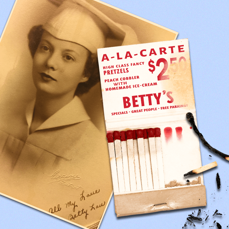
Bettys matches by Beth Mathews
In the throes of the pandemic in 2020, I continued my daily practice of creating art for myself. It was a practice I craved, an outlet that gave me a sense of creative agency. And when the world felt like it was spinning in the wrong direction, like for so many others, anything that resembled nostalgia was a comfort. That nostalgic thinking led to creating graphic props that captured the spirit of my small hometown in Southern Illinois. As a designer now living in Los Angeles, I wanted to share with others the unique and quirky aspects of growing up in Anna, Illinois, a town with a population of 4,163. Anna had one motel and one bowling alley, affectionately known as “Anna Mo” and “Anna Bo,” and I was on a quest to redesign their marketing materials as if we were living in the 1960s—a graphic period I love.
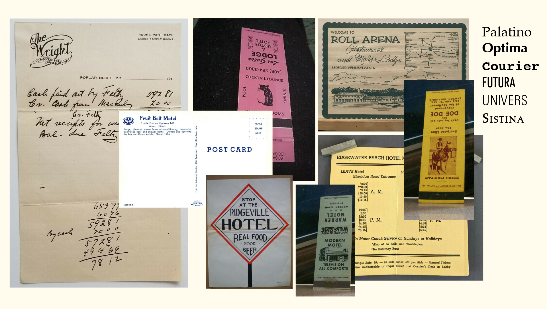
Anna Plaza Motel Refrences
Diving into graphic archives became essential for this project. I used sites like eBay to find motel ephemera and archive.org to research original business names in Anna. If it weren’t for this research, I would never have learned about Buzz, the guy with one thumb who worked the grill at the bowling alley, with customers claiming he made the best burger in town. I also wouldn’t have known that Anna once had another motel called the “Fruit Belt Motel,” which might just be the sweetest name for a resting spot I’ve ever heard. Learning about historical details and studying graphic styles from past designers got me hooked on creating storytelling-driven graphics. But I wanted it to not just look authentic but feel authentic. As if the work I created going forward could be pulled out of an old dusty attic with the hope that no one could tell the difference between work from 1930 and 2020. Thus propelled my journey into digging through more archives and creating more storytelling graphics.
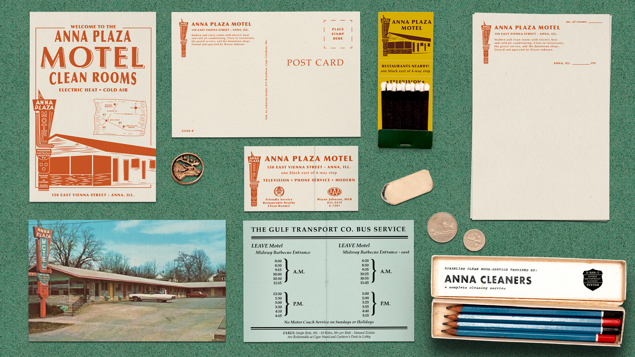
Anna Motel by Beth Mathews
In the summer of 2022, I attended Annie Atkin’s prop designworkshop in Dublin, Ireland. Annie is a master of graphic prop design, and it was there that I learned physical prop-making techniques like how to authentically age paper and the tips and tricks of ink and calligraphy. Her workshop ended with an assignment where we had to break down a story and create the graphic props.
I chose to create the items that would have been found in my husband’s grandmother’s fishing tackle box from 1967, set in northern Minnesota. It was a fun experiment in imagining what would actually have been in a tackle box, which was so much more than just fishing lures. A first aid kit, a fishing license with a paper cover that she most likely got from her local bank, and a tape measure from her husband's car dealership. Through research, I discovered that in 1967, women couldn't get a fishing license on their own and had to be listed under their husband's license! All of these pieces helped tell an authentic story. And because of the imperfections in each piece, the designs ended up feeling warm, nostalgic, and trustworthy. Just like a grandma's fishing tackle box should be in one's mind.
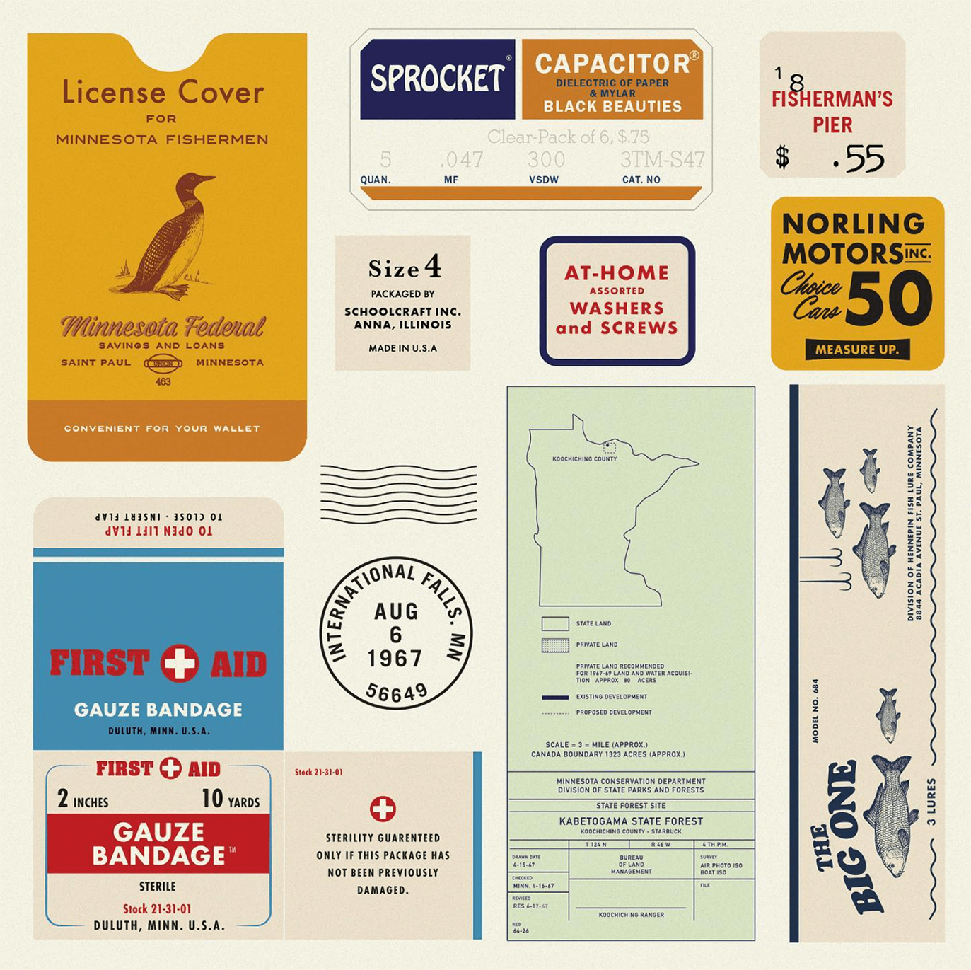
Tackel Box by Beth Mathews
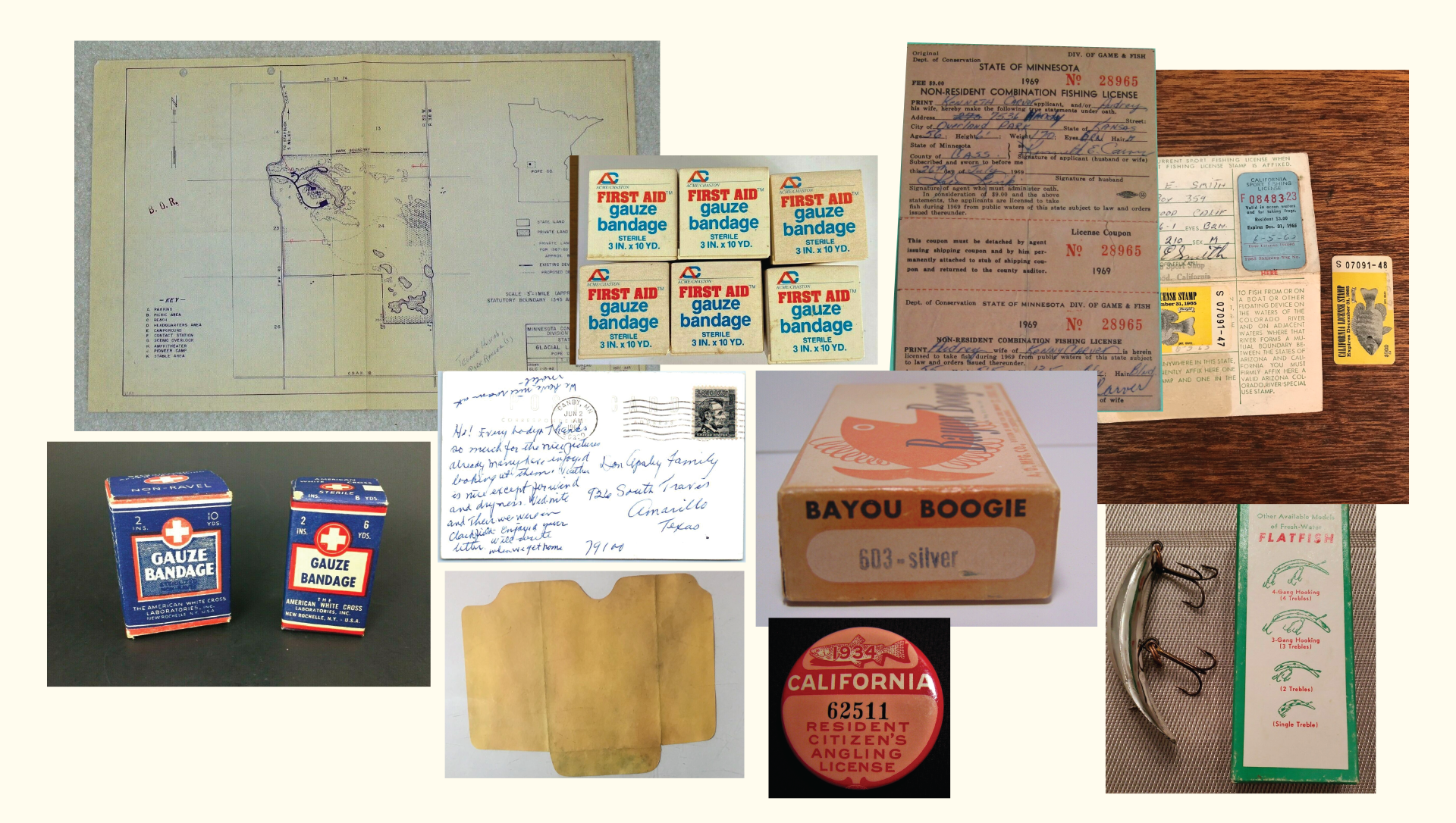
Tackel Box Refrences
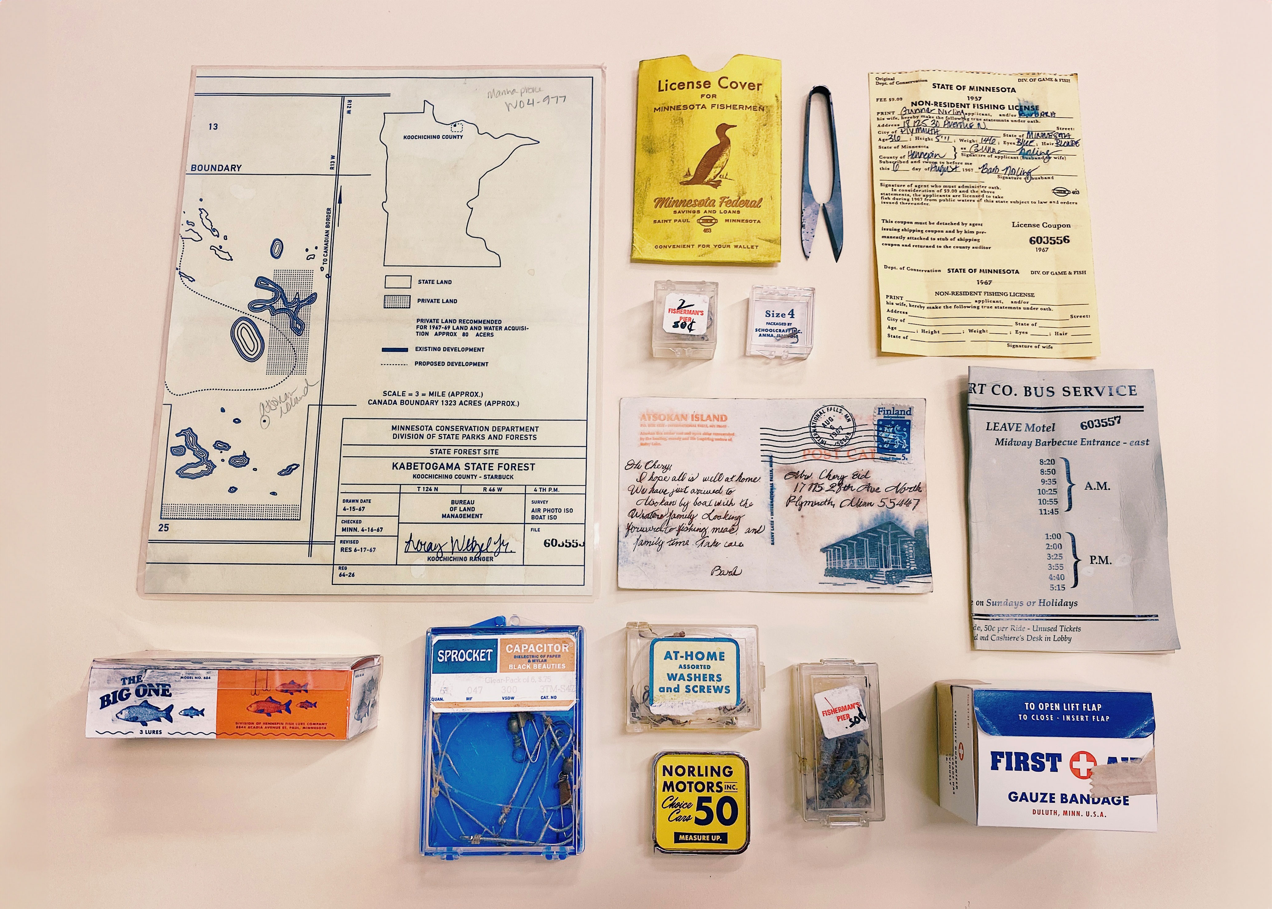
Tackel Box Props
Curiosity as Fuel: From Alfred Hitchcock to Estate Sales
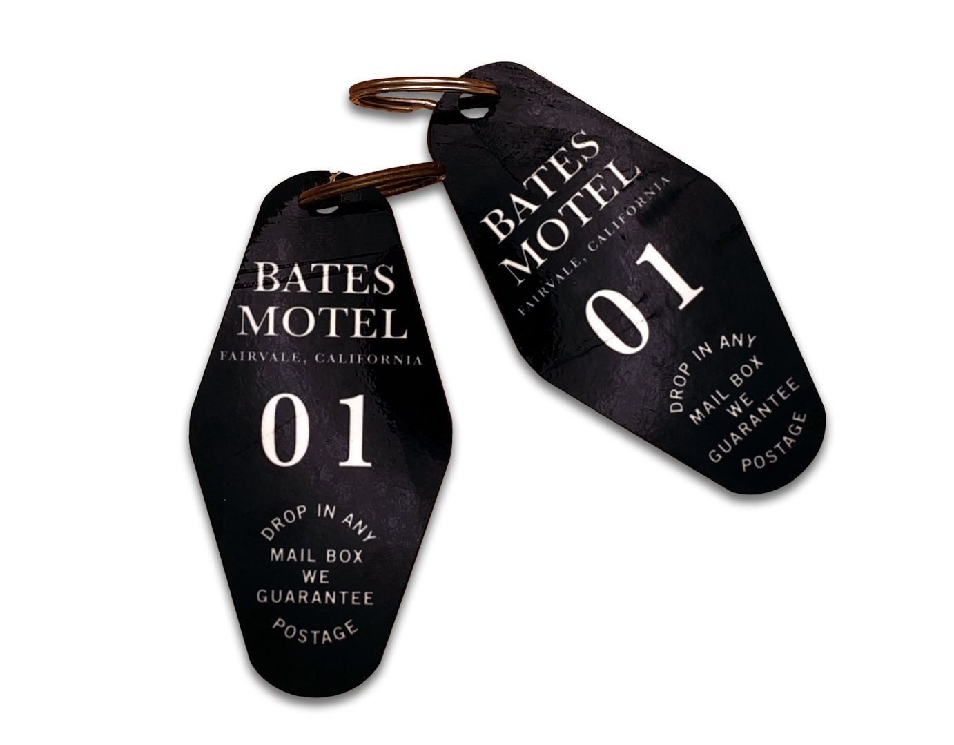
I kept wanting to push myself with design challenges. In October 2023, I created a graphic prop every day for 15 days, inspired by the 1960 thriller Psycho by Alfred Hitchcock. Each prop was handmade daily, whether it was designing and printing them, creating a curtain pattern and printing it on fabric before hand-stitching, and even molding clay to form a motel door number and spray painting the numbers gold.
It was through this project that I truly learned how visuals can help propel a story. Perhaps the audience wouldn’t have caught that Norman Bates gave Marion the room, cabin 1, right next to his office without that very visual cue of the key as seen recreated here.
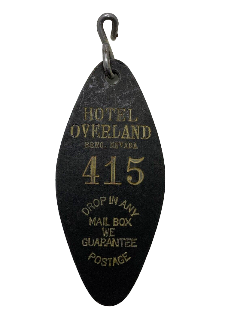
Psycho Key Refrence
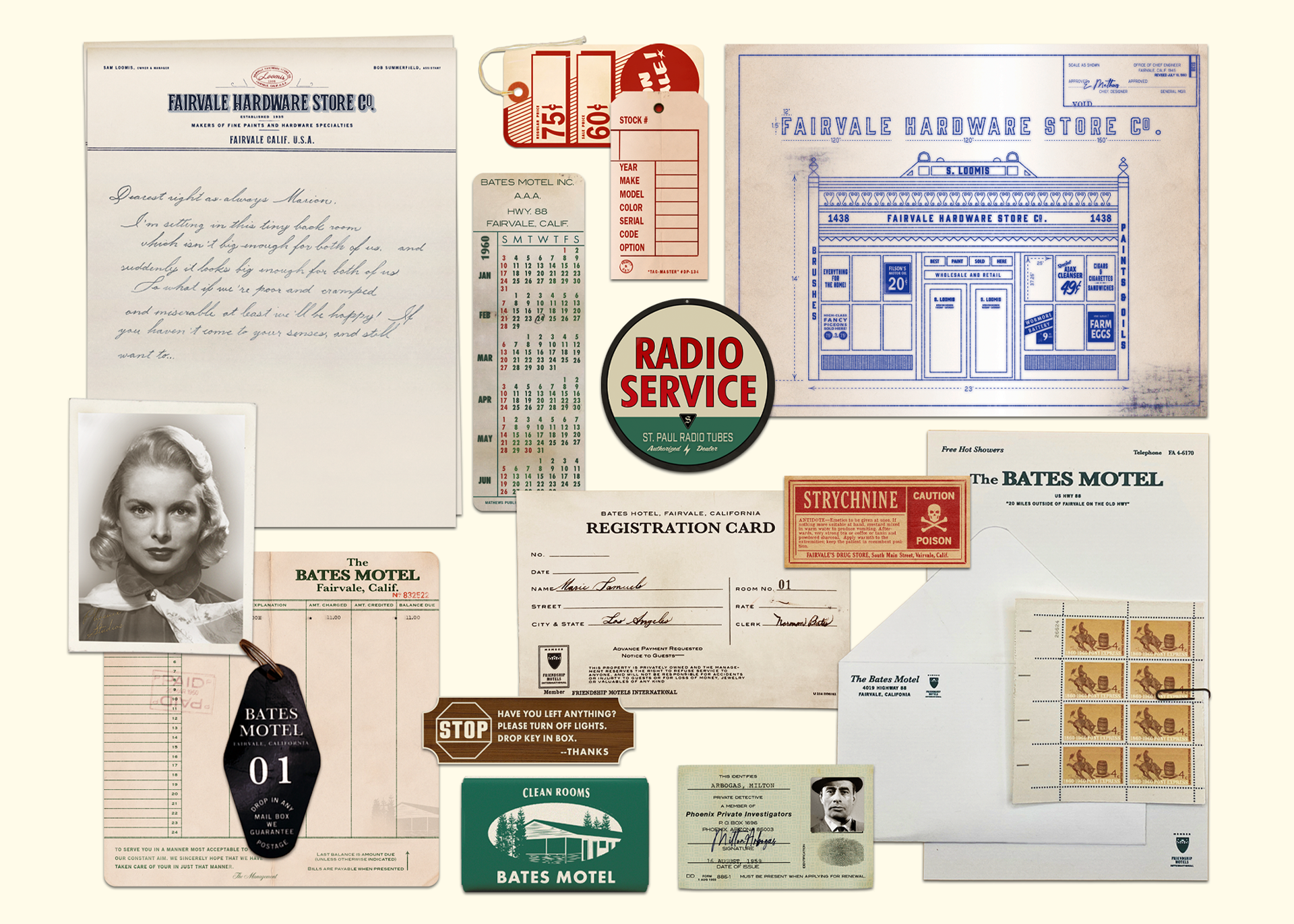
Besides the joy these projects bring to my life, staying curious throughout my design career has been another constant source of fuel. I take myself on field trips to places like the Pasadena Art Center Archives and Special Collections, where I spend the day photographing and scanning their design archives. Without their design archivists, I would have never known about the Art Center Wives Club started in 1956!
And most recently, I went to an estate sale for a man who was a technical illustrator in the ‘50s, which inspired me to design a new typeface based on his handwriting. I’d spent years searching for a font that captured the feeling of sitting in an oil change waiting room, with the smell of burnt coffee lingering in the air. Thanks to his technical drawings as a reference, I created a wobbly typeface called “Parts List” that gives off the question: “Is it a typewriter or handwriting?”
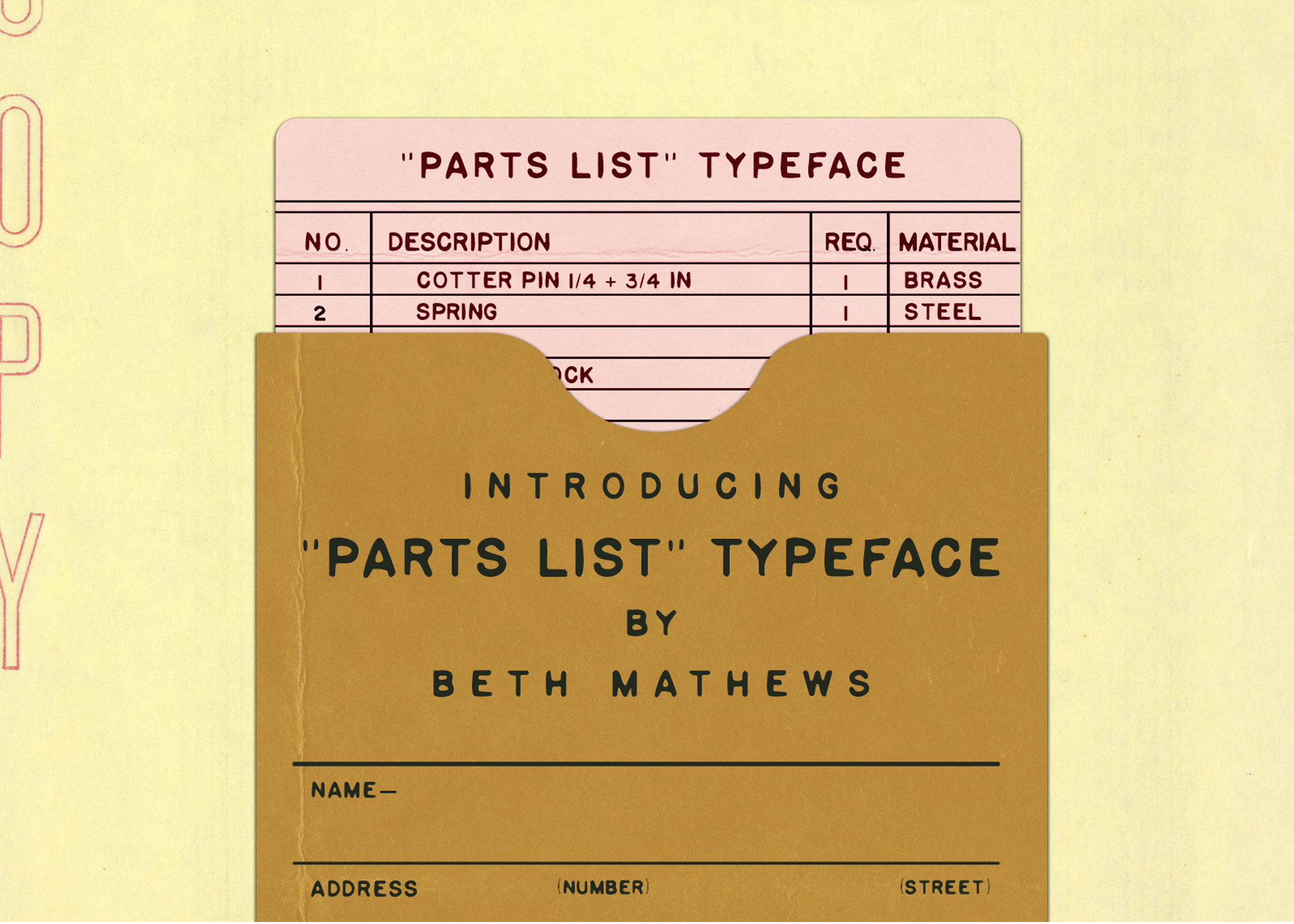
Parts List by Beth Mathews
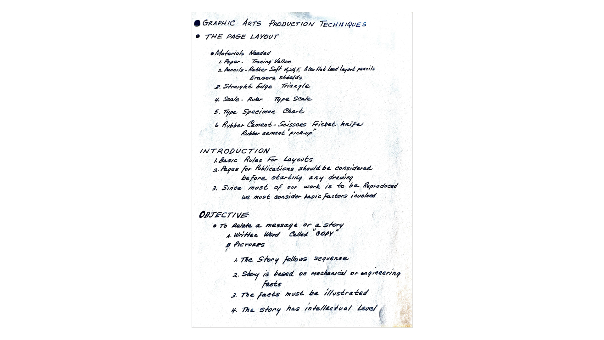
Refrence: Handwriting of Wilbur Dong of Pasadena, California
These personal projects have taught me a lot about creating the work I want to be doing which is rooted in curiosity and storytelling. The idea that one must craft a personal style no longer feels as relevant as creating something for the joy of it. Sharing our life stories through creative work is a beautiful form of self-love and the ultimate expression of self.
Referencing Design from the Past to Create Delight in the Present
Much like the feeling of a perfectly-imperfect matchbook design, creating the sense of nostalgia has become a key theme for many brands in recent years. I think part of it stems from a desire to evoke the “good old days” in a time when the present can feel uncertain. But I also believe that consumers and brands are realizing that it’s not just nostalgia they’re after, they want to feel delighted when they encounter a product or graphic. In 2023, high-end espresso machine company La Marzocco hired me to design 1920’s train-themed graphics for their holiday campaign.
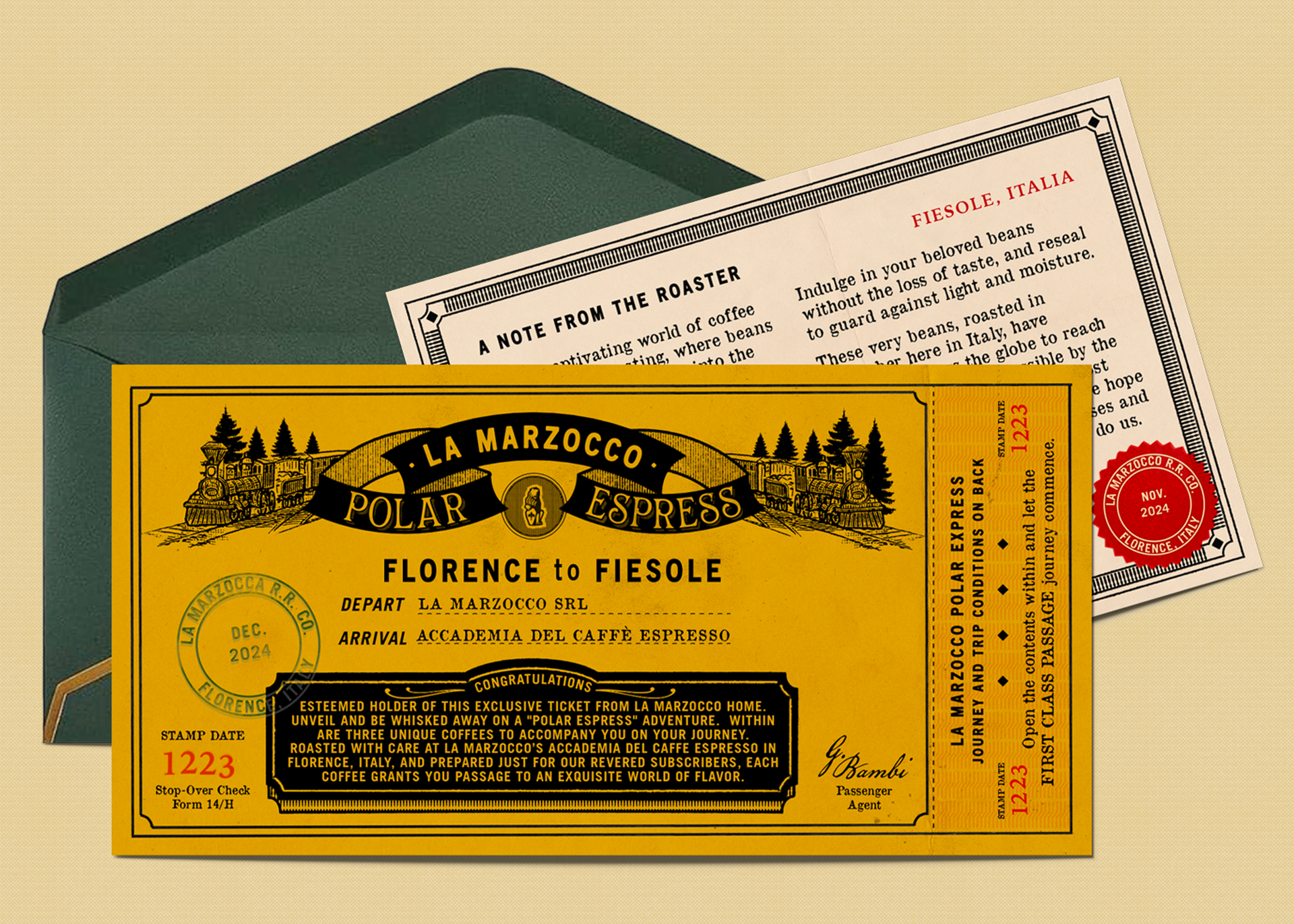
La Marzocco Tickets
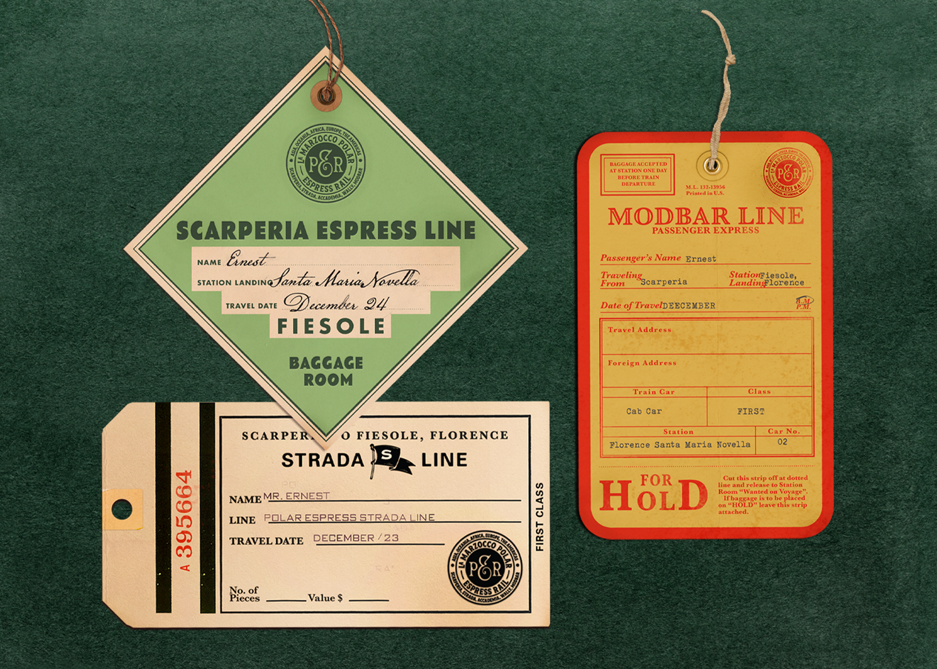
La Marzocco Tags
Brands like Watches of Switzerland brought me on to create a ”1920s New York Broadway“ campaign design, and Coffee Bean and Tea Leaf hired me to design an Art Deco-inspired packaging line in honor of their Los Angeles roots. These brands saw the value in referencing design from the past to create delight in the present.
I owe a great deal of gratitude to the designers of the past for paving the way, and to the archivists who preserve these important pieces of cultural identity. Their work continues to inspire generations of artists, helping us connect with our own authentic creative voices while contributing to this collective design history. I am thankful for this creative journey, which has shown me that joy, delight, curiosity, history, and storytelling can all be part of a lifelong career. How lucky are we to spend our days like this?
Beth Mathews, Senior Art Director and Graphic Designer based in sunny Los Angeles, California, shares her story of falling back in love with design and how the past isn’t just a trend.
I invited Beth to write with The PGDA at the beginning of this year, inspired by her care for history, which showed up in designed pieces, sharing her family's stories and past in the Midwest. Beth's attention to research and commitment to accurate historical references, applied to work that resonates with the present, stood out to me. Enjoy a glance into Beth Mathews’ creative journey. Keep up with Beth at bethmathews.com and @bethmathews
—Morgan Searcy, PGDA Co-Director
Browse The People’s Graphic Design Archive for similar ephemera by searching: matchbooks / Hotel Ephemera / Alfred Hitchcock / Train Tickets